DENTAL
✦BOOKED · 7 MIN READ
The nine seconds that decide whether a patient books with you
A patient in pain scans your home page on a phone and decides fast. Here is what they are looking for, what quietly loses them, and the ten-minute check you can run on your own site today.

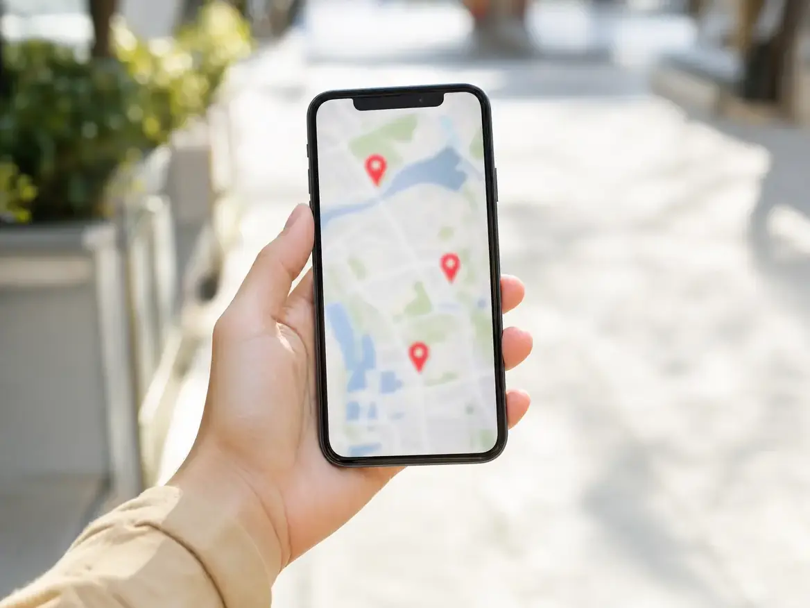
It is twenty to nine on a Tuesday morning and someone four miles from your practice has just bitten down on something hard. They are sitting in a parked car with a phone in one hand and a molar that has suddenly started to matter. They type "dentist near me". Three practices come back. Yours is one of them.
What happens next takes less time than it took you to read that paragraph. And most of what decides it is not your dentistry, your training, or your chair-side manner. It is a handful of small, fixable things on a screen about the width of a playing card.
Nine seconds is not a statistic
We did not measure it, and anyone who quotes you a precise figure is selling you a guess. Nine seconds is a stand-in for something you already know from using your own phone: the gap between a page appearing and you deciding whether to stay is short, mostly pre-verbal, and completely unsentimental. You do not read. You scan for the one thing you came for. If it is not there, you go back.
So the useful question is not how long the window is. It is what a person in pain is trying to answer inside it — and whether your home page answers it on a phone, above the fold, without a single tap.
Four questions, asked in this order
Watch someone find a dentist and the same sequence shows up every time. It is not a marketing funnel. It is a person triaging.
- Are you actually near me? Not "serving the greater Indianapolis area". A neighborhood, a cross street, something a local recognizes.
- Are you open, and when? Today. Right now. Saturday.
- Will you take my insurance, or what is this going to cost? This is the one most practices bury.
- How do I reach a human in the next thirty seconds?
A plain home page that answers those four things will beat a much prettier one that answers none of them. The order matters too — a patient who cannot confirm question one never gets as far as your smile gallery.
The thing that is almost never the problem
Here is where we argue against our own trade. When a practice says patients are not booking, the reflex answer from most agencies is a redesign. New look, new stock photography, new hero video, six weeks, invoice attached.
Most of the time, the design is not what lost the visit.
We have looked at plenty of genuinely good-looking home pages that still leak patients, because the phone number is baked into an image instead of being a link, or the hours sit three scrolls down, or the "Book Online" button opens a portal that asks for a password. The site did not fail on taste. It failed on plumbing. A redesign fixes the taste and often leaves the plumbing exactly where it was — which is how a practice pays for a beautiful new site and sees nothing change on the schedule.
Before you spend on a rebuild, spend twenty minutes proving you need one. And if your current site answers the four questions and the phone still does not ring, the problem is upstream — people are not finding you at all — and no amount of new typography fixes that.
The tap that does not work
Go to your own home page on your own phone and try to call yourself. Not from a desktop. From the phone, the way a patient would, standing up, one-handed.
A surprising number of practice sites fail this. The number is rendered inside a header graphic, so tapping it does nothing at all. Or it is a real link, but it lives in a hamburger menu behind two taps. Or it is a tracking number that reads differently from the one on your Google profile and your front door, which quietly confuses patients and Google in equal measure.
The fix is unglamorous and takes a developer about ten minutes: the number is live text, it is a tel: link, it is visible without scrolling, and it is the same number everywhere your practice appears.
Hours, and the question nobody puts on the page
Every practice publishes opening hours. Almost none answer the question the anxious patient is actually asking, which is: what happens if this gets worse tonight?
You do not need an emergency service to answer it. You need one honest sentence. "If you are in pain outside our hours, call and leave a message — we check them first thing and we hold same-day slots for emergencies." If that is not true of your practice, say what is true instead. That sentence is worth more than it looks, because it is the first evidence on the page that a human being is behind it.
Insurance is where the visit dies quietly
This is the most common silent exit we see. A patient scans for the name of their plan, does not find it, and leaves — not because you do not take it, but because you did not say.
You do not have to publish fees to fix this, and you should not publish anything you cannot stand behind. What you can do is name the plans you are in network with, say plainly that you will file for out-of-network patients if you do, and add one line about a membership plan or payment options if you offer them. Ambiguity does not read as flexibility. It reads as expensive.
Speed matters, but not the way it gets sold
The second reflex upsell is performance. Someone runs a page-speed tool, hands you a red score, and quotes you for optimization.
Speed does matter. A page still assembling itself while a thumb hovers over the back button will lose that patient. But the score is not the point, and chasing it into the nineties is usually a poor use of your money. What actually loses people is coarse and visible: an enormous uncompressed hero image, an autoplaying video that eats the connection in a parking lot with two bars, a chat widget that loads before your phone number does.
Turn wifi off and load your own site on cellular. That is the test that counts. If the page is usable in a couple of seconds and nothing jumps around as it settles, your speed is fine and your budget belongs somewhere else.
Ten minutes, your own phone, right now
Do this on the device a patient would use, on cellular, and be unkind about it.
- Tap your phone number. Does it dial? From the home page, without opening a menu?
- Look at the first screen only. Without scrolling, can a stranger tell what city you are in and that you are a dentist?
- Find your hours. Count the scrolls and the taps. More than one of either is too many.
- Search the page for your two biggest insurance plans. Are they named anywhere at all?
- Press the booking button. Does it ask for an account, a password, or a card before it asks for a name?
- Turn off wifi and reload. Time it roughly. Watch whether the text jumps as images land.
- Check the map link. Does it open your actual pin, or a generic address search?
- Call your own line at seven in the evening. Listen to exactly what a new patient hears.
- Compare the name, number, and address on your site against your Google Business Profile. They should match character for character.
Nothing on that list needs an agency. Most of it is a short email to whoever maintains your site. If four or more items fail, you have found the leak — and it is far cheaper to fix than to redesign around.
Where we would tell you not to bother
This isn't for you if: your schedule is full, your hygiene recall is healthy, and you are already turning patients away. Your website is not your constraint, and you should spend nowhere near it. The same goes if you are mid-move, mid-rebrand, or about to change your name — fixing a site you are about to replace is money spent twice.
And if every check above passes and the phone is still quiet, stop working on the website. The problem is that patients are not reaching it in the first place, which is a different job entirely.
If you would like a second pair of eyes on any of it, our free Practice Growth Blueprint is a written read of how your practice shows up online — yours to keep, and no sales call is required to get it.